The notification that ruined the screenshot
Banners, names, and message previews sit on top of the thing you meant to share. Cover them or wait them out.
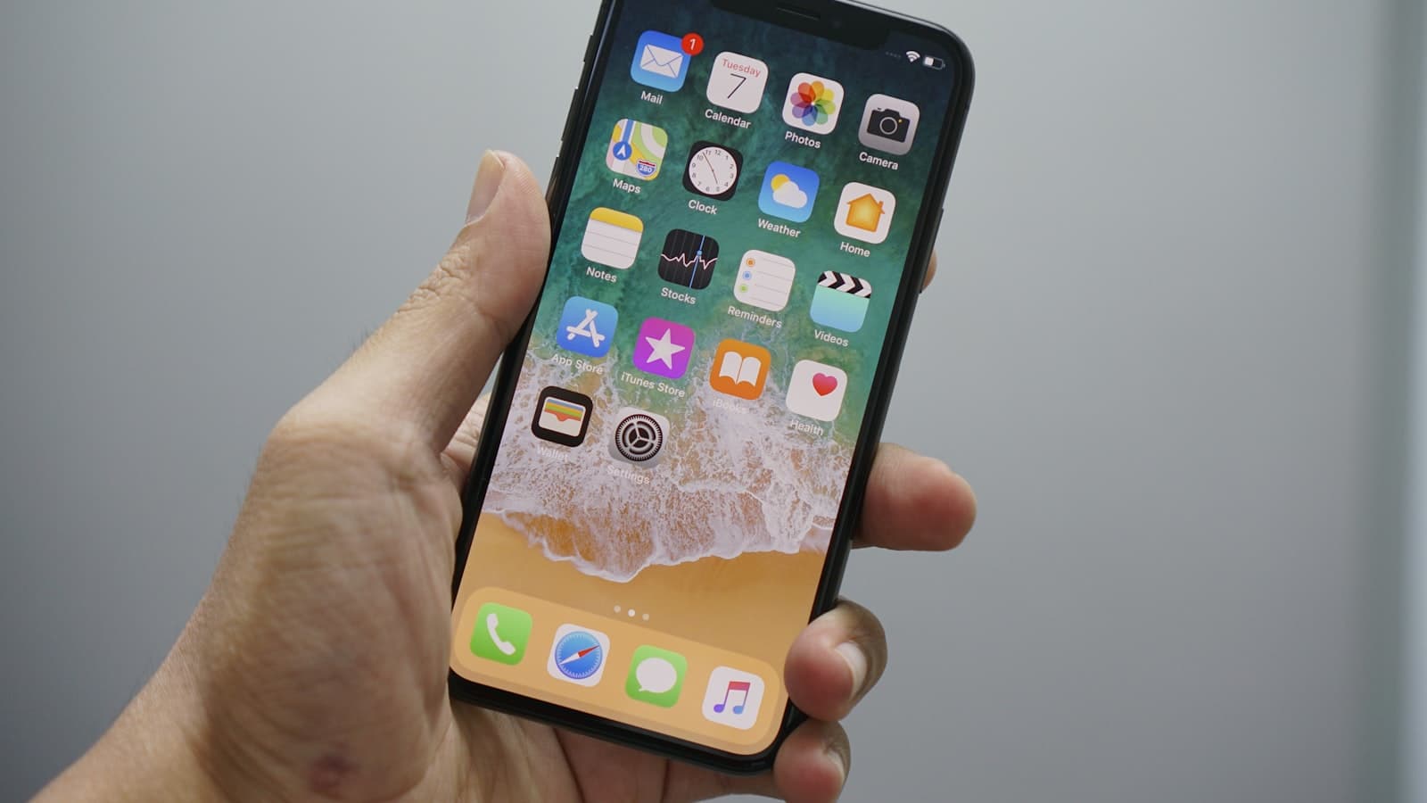
You framed the bug. Then a banner from your partner landed on the pixels. Now the PNG has a name, a preview, and a timestamp.
The rest of the screenshot can be perfect. The top 80 pixels can still be the leak. People zoom on the error dialog and never look at the status bar. Recipients do.
Should you wait for the banner, or cover it?
On iPhone, wait for the banner to slide. On Windows, wait for the toast. On macOS, the same. If you already captured, bar the top of the image. Do not count on “nobody will notice 40 pixels.” Do not count on a light blur over a preview line that still says a name and a first sentence.
Recapture is cleaner than a bar if you can still reproduce the bug. If you cannot, bar. Cropping the entire top chrome is crop-as-redaction when you do not need the clock. When you need the clock to prove timing, bar only the preview text. Crop vs bar.
Why are lock-screen captures worse?
Message previews, delivery apps, banking, calendar titles with a person’s name. The wallpaper is not the problem. The stacked toasts are. Disable lock-screen previews if you live on screenshots, or never photograph a lock screen for a meme. If the meme is already in a group chat, the previews are already in other people’s camera rolls.
A crop that keeps one toast “because it’s funny” is still a toast. Bar it. If the funny part is the wallpaper, recapture with previews off.
Do meeting screenshots collect other apps’ toasts?
Yes. Zoom and Meet fills collect Slack, SMS, and mail. The meeting is the subject. The toast is a second subject you did not mean to publish. Full-screen the call, pause notifications, or bar the intrusion after the fact. Walkthrough for those stills: Zoom/Meet.
Presenter mode does not save you if the toast draws on top of the shared window in your local screenshot. Your local screenshot is what you attach to the recap email.
What should you cover besides the banner body?
App icon. Sender name. First line of the message. Timestamp if it identifies a timezone or a shift. Reply-later buttons that still show a subject. Keyboard suggestions that echo a password. Notification shade pulled down “just to check” in the same snip as the bug.
A mosaic over the preview is the short-string problem again: names and codes are short. Use a fill. Check the export at the top edge. A one-pixel gap under the bar is enough for a descender.
Can you rely on “Do Not Disturb” instead of redaction?
Focus modes help the next capture. They do not clean the last one. They also fail when a VIP bypass is on, or when the screenshot is of someone else’s machine. Redaction is for the file. DND is for the session. Use both when you can. Use the bar when you cannot.
If the banner is already in the PNG, paint the strip and download a new file. Do not send the original “plus we’ll mention the banner in the caption.” Captions get stripped. Pixels do not.
What about the notification shade pulled down on purpose?
That is not an accident. It is a screenshot of other people’s mail subjects, OTPs, and calendar titles. Do not post it as “look at this spam.” Bar every preview line you would not put in a public tweet. If the point is one spam sender, crop to that row after barring the number and the rest of the shade.
Android heads-up notifications and iOS banners both print a first line. That line is often a name plus a clause. Short text. Do not mosaic it and call it done. Fill it. Recapture with the shade closed if you only needed the app beneath.
Cover the strip in the tab after the fact: bar the banner in BlurThis.